QuickBooks 2013 and the Color/Resolution Controversy
Intuit Blames The User!
By Nancy Smyth, President of Sunburst Software Solutions, Inc.
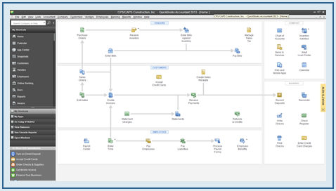
For anyone who has used QuickBooks for a number of years, like I have, when you open QuickBooks 2013 you'll be in for a big surprise at the way it now "looks".
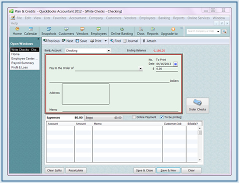
In previous versions of QuickBooks you could pretty much set your own color scheme – granted the number of colors were limited to 15 rather bland colors, but you could find something that you could live with or at least something that you liked and was easy on your eyes.
Perhaps, like myself, you liked "Sea Stone" – shown below, with the "Write Checks" window open:
When you open QuickBooks 2013 for the first time, what you'll see is nothing more than shades of grey:
What Possessed Intuit To Make This Change?
According to Intuit, a top request that they had heard from customers was to make the product easier to use so you could work more efficiently – no additional features, just a better user experience.
As Intuit began planning for the release of QuickBooks 2013, they decided that updating the look and feel of QuickBooks was a key way to deliver on their objective to make it easier to use.
Intuit also says that they were very deliberate about the design decisions they would make.
For example, they wanted to put more focus on the places you do most of your work – like forms, centers, and registers – so they made those areas of the product brighter while using dark colors in the left navigation and top icon bars.
And they increased font sizes selectively throughout QuickBooks 2013 to draw attention to key fields, such as invoice details and totals – while it appears that in other areas the fonts are smaller.
They even said that they worked closely with customers during the process to ensure the changes would help improve ease and efficiency.
Do People Really Like The Lack Of Color?
The lack of color, font sizes, the amount of screen space QuickBooks now requires have all been very controversial subjects.
Some people claim to "love" the updated look because it is so much cleaner and crisp; while others can't tell you loudly enough just how much they HATE it! Personally, I think there are a lot more people who hate it, because Intuit has made some changes in the R4 and then again in the R6 maintenance releases.
In the R4 Maintenance Release, Intuit brought back a "little" bit of color. You could add a small colored flag to the top of QuickBooks and you could change the top icon bar to have a light background. But it didn't change the left navigation panel – that was still dark grey.
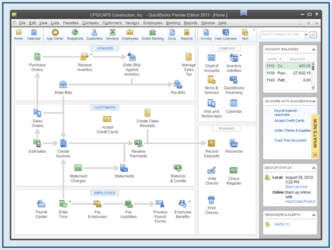
People still screamed their displeasure and Intuit released the R6 maintenance release. While the R6 release did bring back some color, the display is still very much off.
You'll find that QuickBooks will need much more real estate on your computer screen in order for you to see everything that you need to – like the buttons to Save your transactions - especially if you want to use the new left navigation bar.
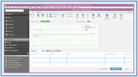
So how the heck do I deal with this so I can get some work done?
Here's what Intuit is saying about this whole situation ---- and please don't shoot the messenger!
Intuit is saying that some of the problems are being caused by a combination of monitor resolutions and Windows Font Setting issues (meaning that you or someone else changed the font settings and/or the resolution on your computer to something other than the default or recommended settings) and that changing it back to the default settings is the solution.
So the first thing that you'll want to do is check to see if the default font settings have been changed – but BEFORE you make any changes write down on a scrap of paper what the original settings are BEFORE you make any changes!
If your computer runs:
Windows 7 or 8 –
- Right click on the Desktop -> click Personalize
- Choose Display on the left hand side
- Choose Smaller-100% (default).
Windows Vista –
- Right click on the Desktop -> click Personalize
- Choose Adjust font size (DPI) on the left side
- Select Default scale (96 DPI)
Windows XP –
- Right click on the Desktop -> choose Properties
- Click on the Settings tab -> click the Advanced button
- Set the DPI settings to Normal size (96 DPI)
If your font settings are currently at their default or recommended settings, let's go look at what your resolution is set to.
NOTE: You should close all currently running programs on your computer because a reboot may be required.
If your computer runs:
Windows 7 or 8 –
- Right click on the Desktop -> choose screen resolution
- Look at the Resolution setting – does it say "recommended"? If not, grab the little drop down arrow and look for the recommended setting. Select it. Click Apply.
- You may need to reboot your computer
Windows Vista –
- Right click on the Desktop -> choose Personalize
- Click Display Settings and choose "How do I get the best display" link and follow the instructions
Windows XP –
- Right click on the Desktop -> choose Properties
- Click the Settings tab and move the little slider
I'm going to be quite honest and tell you that I have a Windows 7 machine and resolution and font sizes are set to the "default" size and I still can't get 2013 to display correctly. As a matter of fact, I can't work in it for more than an hour without getting a headache.
Perhaps 2014 will be better – or – as I've been told for over a year now, you'll get used to it.
I hope you have found this article to be helpful. Please feel free to leave a comment below.
About the Author: Nancy Smyth has supported Intuit products and end-users since 1986, with her primary focus being commercial/government construction contractors.
She has been a Certified QuickBooks ProAdvisor since the inception of the program in 1999; as President of Sunburst Software Solutions, Inc., she is a key player in the development of several QuickBooks Add-Ons for the construction industry.
She is also the author of the QuickBooks for Contractors blog and the Learn to use QuickBooks in your construction business website. Here are more of Nancy's articles written for our website.
To learn more about automating certified payroll, AIA Billing and Payroll Wage Management, visit http://www.sunburstsoftwaresolutions.com/
Back to: More articles by Nancy Smyth
Back to top of this page: QuickBooks 2013 and the Color Resolution Controversy
Back to home page: Construction Project Management
Copyright © 2000-2013 Sunburst Software Solutions, Inc., All Rights Reserved
This article is for contractors to use to help in their construction business. Any other use is strictly prohibited unless and until express written permission is obtained from the author.







New! Comments
Please leave me your comments below. Facebook doesn't notify me of comments but I'm tickled when I come across them and I always respond when I see them.